Saturday, 30 November 2013

First Draft- Audience Feedback

We received both positive and negative feedback about our first draft of 'Love Triangle'. We had only started editing a little bit of the title sequence when this was presented and so could only get feedback on this part of the film which did not include the opening part of our film. Our feedback was quite broad as we had done so little towards completing the film.


Positive Feedback:
  • The music we had selected was very appropriate to the teen angst genre. 
  • Mise en Scene was good and fittted the genre Eg. make up, headphones, pink colours
  • Good range of shots, (close up, mid shot, long shot, extreme close up)
  • Title font and style were appropriate. 
  • Over the shoulder shot was particularly effective 
Negative Feedback
  • Lighting outside is dark, so not realistic to the character leaving for school
  • The character's facial expression and body language does not show that she is happy 
  • Quicker editing of the shots so it flows better
  • Incorporate the title into the title sequence better.
  • No voice over
  • Needs different transitions 
Some of these feedback points were due to the fact that we hadn't finished the title sequences and film opening for example, the voice over and incorporating the title in the film. However we took these points and used them to improve our film to make it the best we could. This included re-filming and editing the whole opening and title sequence again (because it was dark outside).

Music Ideas

We brainstormed as a group of what music is required for our film. We took in to account everything we have learnt so far from studying other teen angst films such as Mean Girls, Juno and Easy A. We had also done our own research and so each had a rough idea of which music would be the best. We all agreed we needed upbeat, cheerful music. This is because the target audience of teenagers enjoy music that makes them feel happy and want to join in singing or dancing. However we also wanted some slower music that connoted deeper feelings and that the character was worried. This is because we wanted to contrast as much as we could between the two music track in order to contrast between the two locations in the film.

I spent many hours in lesson and outside of lesson collecting music tracks from http://www.freeplaymusic.com/ that i believed was suitable and would work well in our film. After i had enough tracks to show my group, i gained feedback from them and then went back and looked for more tracks that suited the feedback i had received. After getting feedback a couple of times and discussing the music again we finally decided upon two tracks.

Thursday, 28 November 2013

Film Title Progression 'Love Triangle'


The first idea we tried included the iconography of a book. We thought this would be a good idea this connotes the school life of the teenage target audience and this would attract them to watch the them. It was also the idea that many teenagers keep a diary or record of their day/feelings. We thought that this would, once again, appeal to the audience 


We came up with many ideas of what the film title and logo should look like.
We had to keep adjusting what we thought would be appropriate to the genre, fit with the story line and also indicate the target audience. The text is a white serif font which was the best text to put over a brown book. However we did not like this idea as a book had no relevance to our film


The second idea we had was more relevant to our film. We tried to incorporate the iconography of a triangle. We always changed the colour of the font to a red colour, trying to help connote the idea of love. We also did this by making the triangle in the title pink and this is stereotypically the colour that connotes love. There was a heart placed in the middle of triangle which suggests that love was the central focus of the film and that love has created a love triangle situation. However we thought this design looked too complicated and so we tried something else.


Next, we tried a completely different idea. We introduced the background of a sticky note as many teenagers use these in order to remember things and are very familiar with sticky notes. We also adjusted the words 'Love Triangle' to a purple colour and a sans serif font that looked like a scribble. This scribble font connotes school life of a teenager and is in a style that looks like the write in. This would attract our target audience as they would associate this with school which they can relate to. We also used a simple heart outline that was not filled in the middle. This connoted that the there is romance in the film but it is not quite complete.


We decided that we didn't like any of the above text styles and so tried a different font. We liked the purple colour as that connoted that the film was about females and the target audience was female. We also liked the sans serif font as it connotes romance and also teenagers handwriting which is related to school which is one of the settings in our film. We tried putting this font and purple heart onto the sticky note, however we didn't like this idea as it didn't fit naturally into the setting in our film. We kept the font and heart as this was hugely effective and added this final title to the film.

Wednesday, 27 November 2013

Our film characters

There are two main groups of characters within our film 'love triangle'. There are the popular group who do everything and anything to improve their social status and the opinion of them from their peers. This group includes the most popular girl in the school 'Yasmin'.
Within this main group there are the following characters:

Leah Fowles-playing Yasmin  


Lily Shepphard-playing Lucy


Jack Payne-playing Joe 


The second main group is the younger, less popular group in the film. However this group contains the main character Charlotte. They are represented as hard working and lower down the social rankings than the previous group. We chose these characters as they are younger than the other actors and so they would fit the role easier. This group included: 

Emily Prout-playing Charlotte


Tamica Fabray-Smith-playing Sophie 


Anna Templeman- playing Katy


Hannah Holton- playing Courtney


There is also a love interest in the film. His name is Blake and he fits into the older more popular group. This is because he is Yasmin's boyfriend. He is attractive and he is very popular with the girls in the school including our main character 'Charlotte' which is why there is conflict between Yasmin and Charlotte. 

Harry Shipp-playing Blake

Tuesday, 26 November 2013

Storyboards


These are the story boards for our title and opening sequences. They include a quick sketch of what the shot will look like, the shot type and a description of what is going to happen in the shot and for how long.


Voiceover Script

Hi, I'm Charlotte, I'm 15 and i live with my mum and my two sisters.

And this is my story.

I'm in year 10 at Mountfort college.

I have a really close group of friends; sophie, she's the funny one, Katy, she's the one that really cares and Courtney, well she's on another planet.

We've been friends for years, we've always been close, that's all there is to it.

And that's Yasmin, with the popular group. She's head girl, y'know everybody loves her, they do everything for her, see.

Although I have my friends, I can feel so alone.

I'm not really happy. I just wish i could fit in with the popular group, because there he is, Blake Andrews, i've always liked him.

But i have no chance as Yasmin is he girlfriend, she's always nasty to me around school.

And that's the love triangle.

Monday, 25 November 2013

Plot Outline

The plot outline for our film is that there are three main characters who each have a different opinion on the others but this starts to change as the film progresses. Each represents a social group stereotyped with modern schools, along with their respective friends.

-Blake, who is a stereotypical good looking guy with blonde hair and blue eyes. He is the most popular guy in the school and the majority of the girls adore him.
-Yasmin is the most popular girl in the school and is respected by everyone throughout the school. She is good looking and has long brown hair and brown eyes. She is Blake's girlfriend.
-Charlotte is younger than Blake and Yasmin and is a stereotypical 'average' girl that the audience will be able to relate to as many of them will have been in her situation before. She has long blonde/brown hair and hazel eyes. She dreams of popularity and also has a crush on Blake.

This shows how we came up with the name 'Love Triangle' for our film. Love is the key aspect of our film along with popularity as this relates to most high schools across the world. As there are three main characters who are each involved with feelings about each other (not necessarily positive feelings) we thought we would name the film Love Triangle.

Saturday, 23 November 2013

Research into teen angst films

Most teen angst films are school related as this is the place that teenagers form relationships with their peers, whether it is hatred, love or friendship. They also spend lots of time there and the majority of their teenage years are focused on school. The films are usually set in high schools as this the age group of the target audience (12- 18). This is because the target audience can relate to this location and the feelings for the above reasons. Some examples that i have seen this in are:


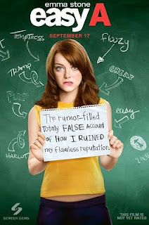
The main characters in teen agnst film are girls. This is because they are stereotypically the gender that faces more problems emotionally and mentally that the target audience of girls can relate to. However there is usually a love interest that is a boy. He is stereotypically good looking and girls can relate to this aswell. There are usually two main social groups of girls. There are the 'good looking, popular, bitchy girls' such as the three girls in the mean girls picture above and the 'innocent, less popular, nerdy girls' such as in the easy a picture.


In studying other films in the teen angst genre there were a few title conventions i noticed. These include pink/stereotypically girly colours, different sized letters and the majority of them were in sans serif font. The pink colours are stereotypical of the young female gender and so would connote that this is the main target audience for the film or the film is a teen angst. The different sized letters included in the titles could connote uncertainty and confusion which is how the characters could be feeling about the situations in the film. The sans serif font connotes that the film is relaxed and not a serious film. It indicates that the genre is friendly and relatable. Back grounds are also stereotypically pink for these same reasons.

Friday, 22 November 2013

Teen Angst- Moodboard


This is a moodboard for the teen angst genre of film. It includes films such as High School Musical, Diary of a Wimpy Kid, Mean Girls, Hairspray and Juno. These images are stereotypical of the teen angst genre, as the films are usually based around teenage girls who have a love interest and are faced with a situation or problem that they eventually overcome. The films try to portray the stereotypical life's of teenagers of that time. Billy Elliot and Diary of a Wimpy Kid is a counter type of the teen angst genre as far as the main character is a male.

Wednesday, 20 November 2013


This is the title sequence timeline for 'The Conjuring'
It includes each one of the titles and what each one says and at what times. It also includes the timeline for what images there were during each title, as well as the sound timeline and other details such as if it is high budget and the effect of the title sequences

Tuesday, 12 November 2013

Film Production Logos

The words '20th century fox television' is in capital letters and is also in the form of a statue. There are also spotlights which help show it is very important along with the above mentioned. Also the height of the monument implies that they are considered one of the big five when it comes to production companies. The statue is a golden colour which has the connotative effect of suggesting they are the best. Examples of their films include; Ice Age, Dodge-ball, Garfield, The day after tomorrow and The Simpsons movie.


The boy is on the moon fishing, above the clouds. This connotes that he could be dreaming and that he is in a special place which suggests that the films they produce could be very special and like fairy-tales. Also the fact he is on the moon could connote that the films are 'out of this world'. The text is all in capitals and in a sans serif font. This connotes they are a serious company. Examples of movies include; Shrek, Madagascar, Kung-fu panda and Over the hedge.

The logo is very plain as it only has the word 'Film' on a red background. However the white lines resemble the shape of a '4'. As the word 'Film' is the main focus of the logo it tells the audience that they do focus on films and not television. Some big films they have produced or co-produced are; 12 Years a slave, 127 hours, Slum-dog Millionaire and This is England.


The 'Warp Films' logo denotes the shape of the world. This connotes that warp films are or aim to be globally recognised. Also the name of the company is going through the middle of the 'world' which connotes that the aim to be a part of everyone's life. The colour is black and white which connotes that the company are basic or simple. The text is at a slight angle suggesting progress and that they are successful. Some films they have produced or co-produced are; This is England, Submarine and Donkey Punch

The name 'Take Two' connotes that they aren't perfect and it might take a while or 'two' to get it right. Also there are two t's that stand for the initials of the companies name and these are made out of film reels which automatically connotes they are a film production company. The whole logo is on a positive slant going upwards. This connotes progress and that they are moving forwards successfully and positively.

Thursday, 7 November 2013


In our prelimanary task, we were given a story board to follow and interpret. We had to follow the basic shots and come up with our own dialogue. This task allowed us to get to grips with the editing software on the computers as it was simple cutting and moving clips around. We had to show an understanding of the 180 degree rule. This is where we only film one half of the room and we keep the camera on the same side. This allows the audience to follow the storyline easier. We also practiced shot reverse shot in editing during dialogue. Also we had to show match on action. This was shown when i opened the door and the next shot was me walking into the room. The audience knows that i walked into the room even if the shots don't show it clearly. We faced one problem which was the sound in the background from other students in the school.

Tuesday, 5 November 2013

Film Case Study: THE SELFISH GIANT

                                                           The Selfish Giant Trailer

The selfish giant is an independent British drama film that was shot on a small budget and directed by Clio Barnard, who is known for documentaries and feature films. This was produced by Moonspun production with the help of Film4. The cast include Conner Chapman, Sean Glider and Shaun Thomas. The Selfish Giant was originally an Oscar Wilde fairy tale but has been remade into a modern film set in Bradford. It was released on the 25th of October 2013 in the UK but premiered at the Cannes film festival on the 17th of may 2013 where it won an award. It also won awards at the Toronto international film festival and was in the 2013 Lux prize.
The Trailer is on YouTube which allows everyone to watch it as many times as they wish and also share it with friends and family. There are also interviews from the cast and director on YouTube which could interest some people into going to see it. Newspaper reviews are helpful in persuading people to go and see a film. The Selfish Giant is also on film 4 on demand for people to rent at home which increases views on the film as this is easier and cheaper than going to the cinema.

Film Case Study: GRAVITY

Gravity Official Trailer

Gravity is a science fiction thriller that is set in space and is designed to be viewed in 3D. It was released on the 4th of October 2013 and premiered at the London film festival. It was directed by Alfonso Cuaron, who is known for the films 'Children of men' and 'Harry Potter and the prisoner of askaban' with the production company Warner Brothers. Warner Brothers are considered on of the 'big five' production companies globally and are to credit for some of the biggest films in history such as, the Harry Potter films and The Hobbit. Gravity had a budget of an estimated £105 million and used the Arri Alexa digital motion picture cameras.
The Idea for the film came from Alfonso's love of space and his dream to become an astronaut. The cast included George Clooney and Sandra Bullock and was filmed and created at the Pinewood and Shepperton studios however they had issues with trying to shoot in zero gravity and shooting the space station shots. The film opens with a 13 minute uncut tracking shot of space and the surroundings. On the opening weekend in the USA the film took $55 million from screening alone and has a 8.5/10 rating on IMDb.
The film has won awards at festivals such as the Venice film festival and the Hollywood film festival.
There have been many ways of advertising the film that i have noticed. The first is posters, which i have seen on billboards and bus stops. This is a good way of advertising to lots of people very easily. Another way is showing the trailer on TV and on YouTube. I have seen the trailer on the channel Dave which has a niche audience of men and this is also the target audience for Gravity. Putting the Trailer on YouTube is successful as it means anyone can watch it at any time. Also reviews from others and newspapers can be very persuading when deciding whether to watch a film or not.